
About the author
Published December 7, 2025 · Last reviewed April 26, 2026 · 20 min read
In this article · 7 sections
- Unlocking Creativity Beyond The Lines
- How Grayscale Coloring Quiets an Anxious Mind
- Choosing Your Tools for a Vibrant Grayscale Experience
- Mastering Key Grayscale Coloring Techniques
- How to Start a Mindful Coloring Ritual
- Creative Uses for Your Finished Artwork
- Still Have a Few Questions? Let's Clear Things Up
Picture this: you have a stunning black-and-white photograph, and you get to bring it to life with color. That’s the magic behind grayscale coloring books.
Unlike the coloring books you probably remember from childhood—the ones with just black lines—grayscale gives you a fully-shaded image. All the shadows, highlights, and mid-tones are already there, waiting for you. It’s like having a built-in guide that helps you create something with real depth and realism, even if you don't think you have an "artistic bone" in your body.
Unlocking Creativity Beyond The Lines
Let's be honest, staring at a page of intricate, empty lines can be a little intimidating. Traditional line art puts all the pressure on you to figure out where the shadows should go and how to make things look three-dimensional. It's a lot of work!
Grayscale coloring completely flips that dynamic on its head. It’s less of a blank slate and more of a creative partnership. The foundational tones are already laid down for you, so you can jump straight to the most enjoyable part: playing with color.
Here's an analogy I love: line art gives you the blueprint for a house, but grayscale gives you a fully built home just waiting for you to paint and decorate. The structure is solid. Your only job is to infuse it with your unique personality. This simple shift takes away the pressure to "get it right" and opens the door to pure, meditative flow.
A New Wave In Mindful Hobbies
The adult coloring craze isn't a new phenomenon. Around 2015, the market exploded, jumping from 1 million units to a staggering 12 million sold in the U.S. in just one year. Grayscale coloring is the natural evolution of that movement—it offers a more sophisticated, artistically rewarding experience that clicks with everyone from total beginners to seasoned colorists.
This isn’t just a fad; it’s a reflection of our deep-seated need for screen-free, mindful activities that give us a real sense of accomplishment. The process is simple enough for anyone to start, yet deeply engaging, making it a fantastic tool for calming a restless mind.
Grayscale coloring is less about filling in shapes and more about revealing the color that already exists within the shadows and light. It transforms the coloring process from a simple activity into an artistic journey.
Traditional Line Art vs Grayscale Coloring
So, what's the real difference, and which one is for you? This quick comparison should help clear things up.
| Feature | Traditional Line Art Coloring | Grayscale Coloring |
|---|---|---|
| Foundation | Empty outlines, a "blank canvas" | Pre-shaded image with highlights & shadows |
| Primary Skill | Creating form, shading, and light from scratch | Blending, layering, and enhancing existing tones |
| Difficulty | Can be intimidating for beginners | Very beginner-friendly with a built-in guide |
| End Result | Varies greatly based on skill level | Tends to look dimensional and realistic |
| Best For | Total creative freedom, building skills | Achieving a polished look, relaxation, flow |
While traditional coloring is all about building from the ground up, grayscale lets you jump right into the beautiful finishing touches. It’s a different path to a beautiful result.
Who Are Grayscale Coloring Books For?
You might assume this is a niche for experienced artists, but the truth is, its appeal is incredibly wide. Grayscale is a perfect match for so many people:
- Beginners: It feels a bit like "paint-by-numbers" but with an incredibly professional-looking result, which is a huge confidence booster.
- Experienced Artists: It offers a fresh challenge, pushing you to experiment with blending and glazing techniques in a new way.
- Overthinkers: The pre-shaded guide drastically cuts down on decision fatigue. You can just relax and color without agonizing over every choice.
- Anyone seeking a mindful escape: The gentle focus required to follow the tones pulls you effortlessly into the present moment.
Dipping your toes into a quality monochrome coloring book is a fantastic way to see if this style is for you. The focus shifts from technical skill to the simple, calming joy of applying color. It’s a beautiful invitation to slow down, quiet your mind, and create something stunning without any of the usual pressure.
How Grayscale Coloring Quiets an Anxious Mind
Ever feel like your mind is a web browser with a thousand tabs open, all blaring at once? When anxious thoughts are running on a frantic loop, finding the off-switch can feel utterly impossible. This is where something as simple as coloring a grayscale image can become a surprisingly powerful ally for your mental health. It’s a form of active meditation that doesn't demand you sit in perfect silence; instead, it gently invites you into a state of quiet focus.
Think of it as "meditation with a purpose." The pre-shaded pages in grayscale coloring books are your built-in guide. They give your busy mind a simple, tangible job to do. Instead of getting tangled in a spiral of "what ifs," you’re absorbed in a low-stakes decision: which shade of blue should I layer over this dark gray shadow? That one simple act is often just enough to break the cycle of anxious chatter.
By focusing on the dance of light and shadow already on the paper, you're practicing mindfulness without even realizing it. Your entire world shrinks down to the tip of your pencil and the feel of the page, creating a much-needed sanctuary for your mind to rest.
The Science of Calm Through Creativity
That soothing effect you feel when you're coloring? It’s not just in your head—it's in your brain chemistry. When you engage in a focused, repetitive creative task, you’re actually helping to calm the amygdala, the brain's "fear center" that tends to go into overdrive when we're stressed or anxious. When the amygdala quiets down, the rest of your body gets the message to relax, too.
This deep engagement helps dial back cortisol, the body’s main stress hormone. As you get lost in the process of applying color, your heart rate can slow, your breathing deepens, and your muscles start to unclench. You’re actively shifting your nervous system out of a state of high-alert and into one of rest and calm.
The structure of a grayscale image provides a "scaffold" for your creativity. This removes decision fatigue and the pressure to perform, allowing you to enter a state of flow where anxiety naturally fades into the background.
This process also gives you a profound sense of control in a world that often feels anything but. You are the one choosing the colors, blending the shades, and bringing the image to life. This small act of agency can be incredibly empowering, especially when you’re grappling with the feelings of helplessness that anxiety often brings.
Taming the Overthinking Brain
For anyone who tends to overthink things, a blank white page can be intimidating. The sheer number of possibilities can trigger a complete freeze-up, or what's known as analysis paralysis. Grayscale coloring beautifully sidesteps this problem by giving you clear visual cues from the very start. You’re not starting from scratch; you're building upon a gorgeous foundation.
This guided approach also helps you break the habit of perfectionism, which is a major fuel source for anxiety. Honestly, there's no "right" or "wrong" way to color a grayscale page. The existing shades work with you, ensuring that almost any color you choose will look harmonious and intentional. It’s a fantastic way to build creative confidence. You can explore more strategies for these thought patterns in our guide on how to stop overthinking and find your peace.
Finally, this mindful activity delivers a powerful psychological reward: a real, tangible sense of accomplishment. Anxious thoughts are abstract and can feel endless, but a finished coloring page is a concrete result of your time and focus. Holding that completed piece in your hands gives you a satisfying little dopamine boost, reinforcing a positive cycle that makes the whole experience feel good.
Each page you finish becomes a small, beautiful victory over the noise in your head—proof that you have the power to create your own calm, one color at a time.
Choosing Your Tools for a Vibrant Grayscale Experience
So, you’re ready to dive into grayscale coloring. That’s fantastic! But walk into any art store, and the wall of supplies can feel a little intimidating. Don't worry. Picking the right tools isn't about having the most expensive gear; it's about finding what works with the pre-shaded page to make your art come alive.
Think of the grayscale image as your guide. It’s already done the hard work of figuring out light and shadow. Your job is to simply bring it to life with color. The right tools will feel like a natural extension of that, helping you build depth and vibrancy without a fight.
The Best Mediums for Grayscale Coloring
You can color with just about anything, but a few tools are practically made for grayscale. Each one gives a totally different vibe, so the "best" choice really comes down to the look you're going for.
- Colored Pencils: These are the fan favorite for a reason. Their magic lies in their transparency. You can build up color in light, gentle layers—a technique called glazing—that lets the shadows and highlights underneath peek through. This is how you get that incredible, almost 3D sense of realism.
- Alcohol Markers: If you want bold, punch-you-in-the-eye color, these are your best friend. They deliver smooth, saturated color without a single streak. The only catch? They bleed. A lot. You’ll absolutely need a book with thick, high-quality paper to handle them.
- Water-Based Markers: A great happy-medium. They don’t blend quite as flawlessly as their alcohol-based cousins, but they’re much less likely to bleed through the page. They’re perfect for adding controlled bursts of color to both big spaces and tiny details.
- Gel Pens & White Pencils: Think of these as your finishing touches, the little bits of magic that make a piece pop. A crisp white gel pen or a sharp white pencil is perfect for adding that glint in an eye or the sparkle on a dewdrop. It's a game-changer.
In grayscale coloring, you’re not trying to cover up the gray—you’re trying to tint it. Imagine your color as a piece of stained glass, letting the light and shadow of the original image shine through.
If you’re just starting out, you don’t need a massive set of tools. A simple, high-quality 3-piece coloring pen set designed for detail work is a perfect way to begin. It gives you the precision you need without overwhelming you with choices, letting you just sink into the meditative flow of coloring.
Why Paper Quality Is So Important
Your coloring book's paper isn't just a backdrop; it's your creative partner. The wrong paper can lead to frustrating smudges, torn pages, and colors that just look... flat. Getting familiar with a couple of key terms will make you a much smarter shopper.
First up is GSM (Grams per Square Meter). This is just a fancy way of talking about paper thickness and weight. Your average office paper is about 80 GSM, which is way too flimsy for coloring. For grayscale books, you want to look for paper that's at least 120 GSM. If you’re a marker fan, aim for 160 GSM or even higher to prevent that dreaded bleed-through.
Next, there's "tooth." This describes the tiny bit of texture on the paper’s surface. A paper with more tooth feels slightly rough and literally grabs the pigment from your colored pencils, which is what allows you to build up so many rich layers. On the flip side, smoother paper is better for markers because it lets the ink glide across the surface for that perfectly even finish.
Thankfully, as more of us look for sustainable options, the coloring world is listening. You’ll find more and more publishers using recycled paper and soy-based inks. It’s a trend you can read more about in the adult coloring book market report from Verified Market Research. Choosing a book with great, eco-friendly paper isn’t just good for your art—it’s a small way to support a healthier planet.
Mastering Key Grayscale Coloring Techniques
Alright, let's get our hands dirty. Moving from theory to practice is where the real fun begins. Grayscale coloring is wonderfully intuitive, but a few core techniques can take your art from "that's nice" to "wow, you made that?" And the best part? It's not about owning every art supply under the sun. It's about learning how to work with the shaded image, not against it.
The golden rule, the one thing you need to remember above all else, is to work from light to dark. Always. Start with your lightest colors first. This simple habit protects the beautiful highlights already built into the page, giving your final piece a sense of dimension and life. If you go in heavy with dark colors right away, you risk creating a flat, muddy-looking image. Think of it like tinting a black-and-white photo—you’re just adding a wash of color and letting the shadows do the heavy lifting for you.
Start with Simple Layering
Layering is your foundational skill. It's how you'll build rich, believable color. Forget pressing hard to get a bold shade in one go. Instead, you'll build it up slowly with light, almost feathery strokes. This allows the gray tones underneath to peek through, which is exactly what creates that realistic, almost three-dimensional effect.
Let’s imagine you’re coloring a red rose. Here’s how you’d bring a petal to life:
- Lightest Red First: Grab your lightest red pencil and gently color the entire petal. The goal here is a transparent wash of color, not a thick, opaque coat.
- Add a Medium Tone: Now, pick a slightly darker red. Using that same light pressure, apply this color only where you see the medium-gray shadows on the page.
- Finish with the Darkest Tone: Finally, use your darkest red (or even a deep purple for drama) to touch just the darkest gray areas. This creates the deep shadows that make the petal look like it’s curling away from the light.
See what happened? The colors blend optically, creating a smooth, natural-looking transition without much effort.
You're not trying to conquer the grayscale image; you're collaborating with it. Your job is to enhance the light and shadow that are already there. Getting this mindset right is the real secret to making your art pop.
This infographic gives a simple visual for getting your tools in order before you dive in.
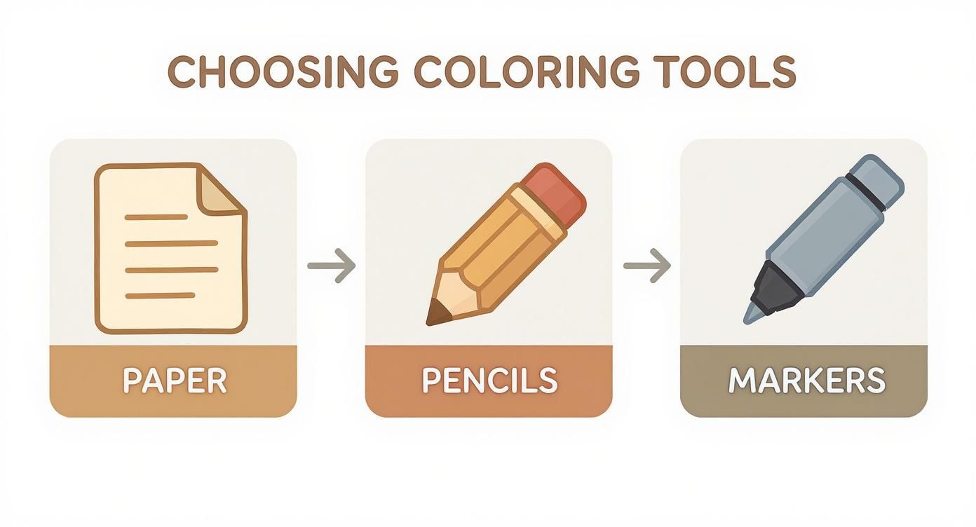
As you can see, the flow is logical. It all starts with your canvas (the paper), moves to your main tools (pencils), and then includes options for bolder effects (markers).
Perfect Your Blending for Smooth Transitions
Blending is what separates the amateurs from the pros. It's the magic that creates those seamless gradients, making your colors flow into one another like melted butter. While layering does some of the work for you, a few specific tricks can take your blending to the next level.
For colored pencils, you have a few great options:
- Colorless Blender Pencil: This is a must-have. It’s basically a wax pencil with no pigment. You just color over your layered areas, and it works like a charm to smooth out the pencil grain and merge the colors.
- Burnishing with a Light Color: This just means applying heavy pressure with a very light-colored pencil (white and cream work wonders) over your layers. It essentially smushes the pigments together, creating a vibrant, almost paint-like finish.
- Solvents (For the Adventurous!): If you're using oil-based pencils, a tiny bit of odorless mineral spirits on a cotton swab can dissolve the pencil binder, creating a beautiful painterly effect. A word of caution: always test this on a scrap piece of paper first!
If you're using alcohol markers, the trick is to work while the ink is still wet. Tackle small sections at a time. Lay down your light color, add the darker shade right beside it, and then quickly go back over the line where they meet with the lighter marker to create a perfect blend.
Add Highlights for That Final Pop
This is the final, magical touch. It’s what breathes life into your artwork. Even though you’ve been carefully preserving the paper’s highlights, adding a few extra bright spots creates an incredible sense of focus and realism. It’s the difference between a picture of a cat and a picture of a cat whose eyes seem to follow you.
A fine-point white gel pen is your best friend here. It’s perfect for adding those tiny, crisp details—the glint in an eye, a sparkle on a water droplet, or the bright sheen on metal. For softer, more subtle highlights, a sharpened white colored pencil also works beautifully.
At first, these steps might feel a bit methodical. But I promise, with a little practice, they’ll become second nature. You'll find yourself intuitively layering, blending, and highlighting, transforming each page into something uniquely yours. The beauty of grayscale coloring books is that they give you the perfect, low-pressure playground to practice and perfect these skills, all while creating something amazing.
How to Start a Mindful Coloring Ritual
It’s one thing to know that grayscale coloring can soothe an anxious mind, but it's a whole other challenge to actually fit it into a packed schedule. But here's the good news: you don't need a whole hour of blissful, uninterrupted silence to feel the difference. A short, intentional ritual can be surprisingly powerful, especially on those days when you feel like you have no time at all.
Think of it as "micro-dosing mindfulness." We're talking about building a simple, repeatable habit that gives you a huge mental health return without a massive time investment. All it takes is 15 minutes. Just 15 minutes to reset your nervous system, turn down the volume on that inner chatter, and find your center again.
This isn't about adding another chore to your to-do list. It’s about creating a deliberate, restorative pause in your day. It’s the perfect way to step back from a stressful workday or gently ease into a peaceful evening, proving that calm can absolutely find a home in even the busiest of lives.
Setting Up Your 15-Minute Sanctuary
What makes a ritual so magical is its consistency. When you create a simple, repeated process, you’re sending a clear signal to your brain that it’s time to shift from the frantic energy of “doing” to the calm state of just “being.” This little trick removes the mental effort of getting started and helps you sink into that creative flow state so much faster.
The goal here is to make the entire experience feel completely effortless. That means getting your space and materials ready ahead of time, so when you’re ready for your moment of peace, everything is just… there.
Here’s a simple way to build your sanctuary:
- Carve Out a Quiet Corner: You don’t need a fancy art studio. This could be your favorite comfy chair, a cleared corner of your desk, or even a specific spot on the couch. The only rule? Make it a screen-free zone for your 15-minute escape.
- Pick Your Page in Advance: At the start of the week, take a moment to flip through your grayscale coloring book and choose a few pages that catch your eye. This simple step completely sidesteps the "what should I color now?" indecision.
- Limit Your Color Palette: This is a game-changer, especially for overthinkers. Instead of being overwhelmed by a giant 72-piece pencil set, just pick out three to five complementary colors that will work for your chosen image. This instantly cuts down on decision fatigue and lets you dive right into the simple joy of coloring.
The Ritual in Action
Once your space and tools are set, the ritual itself is beautifully simple. It’s all about embracing the process, not stressing about the final product. Let go of any pressure to create a "masterpiece" and just lose yourself in the sensory experience.
The point of a mindful coloring ritual isn’t to finish a page. It's to create a pocket of intentional calm where your only job is to breathe and put color on paper. The beautiful art is just a happy side effect.
As you start, really tune into the details. Notice the soft, scratching sound of the pencil on the paper, the texture of the page under your hand, and the way your colors mingle with the printed gray tones. If—and when—your mind drifts to a nagging worry or your endless to-do list, just gently guide your focus back to the image taking shape in front of you.
This simple, structured activity gives your busy mind a safe, quiet place to land. By consistently setting aside this small window of time, you're not just coloring; you're building a powerful, sustainable habit of self-care. You're proving to yourself, one 15-minute session at a time, that you have the power to create your own peace, no matter what chaos is swirling around you.
Creative Uses for Your Finished Artwork
You’ve laid down that last bit of color, and you feel that satisfying hum of a job well done. Now what? Too often, our best work stays tucked away inside the book, never to be seen again. Let’s change that. Think of your finished pages not as the end of the line, but as raw, beautiful material for your next creative impulse.
Giving your art a life beyond the book is how you get to enjoy the process all over again. It’s how your mindful hobby becomes a tangible part of your life—decorations that make you smile, gifts that feel personal, and a source of genuine pride. You’re not just coloring; you’re creating something special.
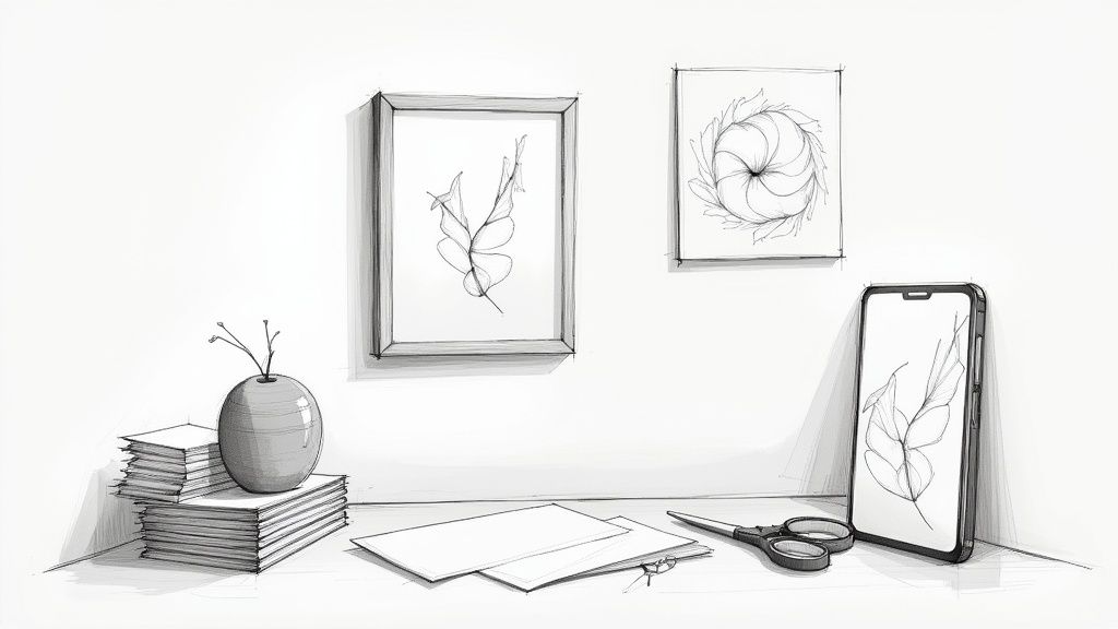
Transform Your Home with Personal Art
Forget generic, mass-produced prints. Imagine a gallery wall in your home that is completely, uniquely you. When you display your own work, you’re honoring the time and focus you dedicated to it. It becomes a beautiful, constant reminder that you have the power to create your own calm.
- Create a Gallery Wall: Pick out three to five of your favorite pieces that have a similar vibe or color palette. Popping them into simple, matching frames gives you an instantly cohesive and professional-looking display for a hallway or that empty space above your desk.
- Themed Decor: Working your way through a series of botanical illustrations from your grayscale coloring books? They’d look amazing framed in a kitchen or sunroom. If you're into architectural scenes, they can add a really sophisticated touch to a home office.
- Rotate Your Collection: Keep your space feeling fresh by swapping out your art with the seasons. It’s the perfect excuse to keep coloring while ensuring your walls always have something new and interesting to look at.
Your finished artwork is a tangible piece of your mindfulness journey. Displaying it is an act of self-appreciation that celebrates your creativity and commitment to your well-being.
Craft Heartfelt DIY Gifts and Projects
Nothing says “I care about you” quite like a handmade gift. Your finished grayscale pages are the perfect starting point for all kinds of thoughtful, one-of-a-kind items that people will actually treasure. It’s a wonderful way to add real value to your hobby and make gift-giving feel more personal and less commercial.
Just one colored page can be turned into so many things:
- Custom Greeting Cards: Carefully cut your artwork and mount it onto blank cardstock. You’ve just made a card that means so much more than anything you could buy in a store.
- Unique Gift Tags: Use a hole punch and a bit of nice ribbon to turn small, interesting sections of your art into gorgeous gift tags.
- Decorative Journal Covers: Take a plain notebook and give it a serious upgrade. Decoupage a finished page onto the cover, and suddenly you have a truly inspiring place to jot down your thoughts.
- Phone Wallpaper: Snap a high-quality photo of your favorite piece in good, natural light. Set it as the background on your phone or tablet for a daily dose of creative pride every time you unlock your screen.
This idea of creative reuse is part of why this hobby has become so popular. The adult coloring book market was valued at around USD 500 million in 2023 and just keeps growing. People are discovering the deep satisfaction that comes from accessible, personal art. If you're interested, you can read more about this growing market, which is forecasted to be worth USD 1.2 billion by 2032.
Still Have a Few Questions? Let's Clear Things Up
Diving into something new always brings up a few questions, and grayscale coloring is no different. Let's walk through some of the most common curiosities I hear so you can jump in with complete confidence.
Lots of people ask, "Do I need to be an artist to do this?" The answer is a huge, resounding no. In fact, grayscale coloring books are one of the best gateways into creative expression precisely because they don't require any prior skill. The shading is already done for you, so all the tricky work of creating depth and form is handled. You just get to bring it to life.
"But What If I'm Terrible at Picking Colors?"
This is probably the biggest fear I see, but it’s one you can let go of right away. The secret is that the grayscale "underpainting" does all the work to make your colors look good. Since the lights and darks—the values—are already mapped out, almost any color you put on top will naturally look like it belongs.
Here's a pro tip for starting out: limit your palette. Seriously. Instead of feeling overwhelmed by a box of 72 pencils, just pick out three shades of a single color—a light, a medium, and a dark. This little trick completely bypasses decision fatigue and lets you sink into the relaxing, meditative flow of coloring.
The real magic of grayscale is that the image does the heavy lifting. You’re not building a masterpiece from scratch; you're simply giving it a soul with your choice of color.
"Is It Possible to Fix a Mistake?"
Of course! We're human, and creative messes are part of the fun. If you’re using colored pencils, a good quality eraser can often lift the pigment right off, especially if you’ve been building up your color in light layers.
For a more stubborn spot or if you're using markers, a white gel pen or a white colored pencil can work wonders to cover the area, letting you color right over it. Just remember, this isn’t about creating a perfect piece for a gallery. It’s about the process. Every page is just a new opportunity to play.
Ready to feel that sense of calm and creative focus for yourself? The Mono Moment Monochrome Coloring Book was designed from the ground up for a totally stress-free experience, with gorgeous, thick paper and art that’s perfect for a mindful escape.

The Monochrome Coloring Book
A single-pen, decision-free coloring book on 160 gsm cream paper — engineered for the wind-down ritual described above.


0 comments